
PMQ Corner #41
What we talk about when we talk about posters?
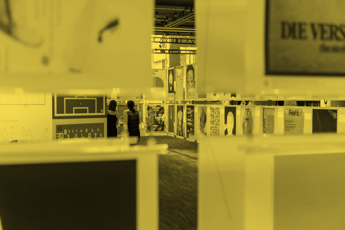
Posterized: Warsaw International Poster Biennale in Hong Kong
Text: Ko Cheung
Translated by: Joel Wong
Photo: PMQ元創方, Warsaw International Poster Biennale in Hong Kong
When was the last time you talked about posters with someone? When a local boy band released the e-version of their concert poster on the internet earlier, it triggered the “aesthetic nerves” of netizens discussing the formation of the portraits, fonts, layout and colour usage, etc... This somewhat reflects even with the change of the times, when poster designs appear on the streets or the internet, whether in a physical or online format, still able to arouse the need and curiosity from the public, as always.

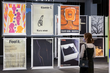
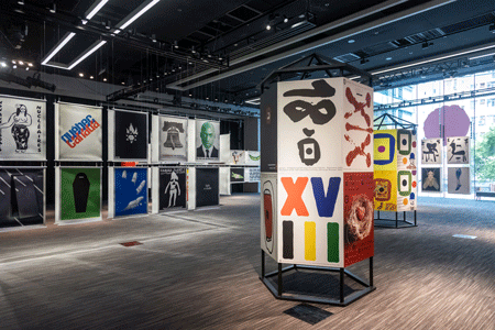
"A great poster is an art that spans time and space, carries different historical and cultural stories along which inspire different types of audiences." Agnieszka Mori (aka Aga), one of the curators of the Posterized exhibition, is pleased to see the people of Hong Kong so intrigued about posters. She hopes that through the Warsaw International Poster Biennale (hereinafter referred to as the Biennale), which is the first time in Hong Kong, the audiences can revisit more than 140 masterpieces from all over the world over half a century and to understand the function and aesthetics of this medium, as well as to obtain the appreciation to the beauty of posters.
The Art of Suppression
Poster design has a high reputation in Poland than in Hong Kong. Hong Kong people come across posters mainly in commercial buildings, colleges, performance venues, transportation hubs, etc. With the majority focus on the products, commercial or promotional information on them. In contrast, the Polish use posters to publicize information without giving up its visual and aesthetic value. As early as 1890 to 1914, local artists used posters to integrate folk art such as fables, fairy tales, and illustrations, or common patterns and fonts such as Art Nouveau and the Vienna Secession to express their ideas during the "All-Polish Youth Movement." From the 1920s to the 1930s, after Poland became independent, designers tend to use simple lines and geometric patterns as the main theme.
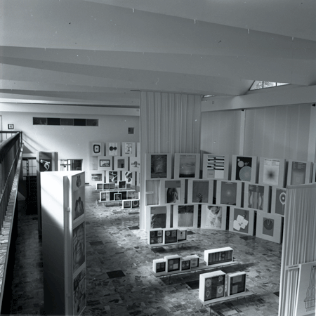
The International Poster Biennale in Warsaw was established in 1966.
After World War II, communist ideology dominated Poland, and posters that emphasizing realism and political propaganda emerged, mostly commissioned by art organizations with artists to create them. Poster artists were stranded between restriction and autonomy. Most of them turn to metaphoric, imagery, and ambiguous directions, to avoid the tight censorship systems and gave full force to the power of creative discourse. This has resulted in countless masterpieces with substantial personal styles, also the birth of the Poland School of Poster. In 1988, an American design historian praised in his book Masters of Polish Poster Art, “Polish posters had a pure poetic quality as if there were no ideological constraints... Possible that suppression helped to produce the best art?”
Stay with the conversation
"Polish posters convey thoughts through imagination and communication with poetry." Aga said. POSTERiZED. Poster Art From Poland in 2018 was also curated with Polish graphic artist and university professor Max. It introduced well-known contemporary Polish poster artists and their works, and all the participants took part in the experimental work "Salute to Hong Kong" with intercultural communication purpose.
This time around, the Posterized exhibition focused on dialogue, adding with academic and historic dialogue. Because the biennale was first held in 1966, it has been undertaken the long history of local poster art. The organizers of the Warsaw Academy of Fine Arts and the Polish Graphic Designers Association (Stowarzyszenie Twórców Grafiki Użytkowej, STGU) select the best posters from all over the world each year and praise the designers through this exhibition platform.
Max started from the classic dot logo created by Polish designer Wojciech Zamecznik for the Biennale in the 1960s. This provided Posterized a feeling of "traffic lights” guide the audience under the new normal of the post-pandemic situation and set foot to a new start: come to the exhibition and appreciate the winning works for the past 50 years (a total of 26 sessions), and revive the fun of attending exhibitions.
Aga said, "We put together Polish School of Posters legends Henryk Tomaszewski, Jan Lenica and Waldemar Świerzy; Japanese design guru Nagai Kazumasa, Kamakura Yusaku, Fukuda Shigeo, Tanaka Kazuko; The works of American Pop Art master Andy Warhol and French pioneer design group GRAPUS and categorized the works by ‘thinking, culture, and advertising’ to facilitate the audience to understand and explore accordingly."
"We put together Polish School of Posters legends Henryk Tomaszewski, Jan Lenica and Waldemar Świerzy; Japanese design guru Nagai Kazumasa, Kamakura Yusaku, Fukuda Shigeo, Tanaka Kazuko; The works of American Pop Art master Andy Warhol and French pioneer design group GRAPUS and categorized the works by ‘thinking, culture, and advertising’ to facilitate the audience to understand and explore accordingly.", Aga said
Perception and Specialization
Aga looks at poster works by fellow artists from the same origin, Henryk's Edward II and Jan Lenica's Wozzeck, both with symbolic patterns and bold brushwork, allowing her to understand their artistic direction and reasons. "But I also enjoy with great admiration the visual and cultural impact of posters from other countries. The poster is like an international language without too much text to explain the core value. For example, Nagai Kazumasa's "300 Million Bottle of a Year" combining a bottle cap with billions of red suns, a simple yet powerful topic with a strong Japanese style. Yumiko Meya's "Beauty, Neo" only uses the silhouette of a bear, a few strands of hair, and a pair of scissors, neatly highlighting the salon theme without being too commercialized. Other works, such as "TSU N A M" on the 311 earthquake, use blue Contre-jour with human hand patterns, allowing audiences to see the waves, and some to see a handshake outline, triggering some multiple interpretations."
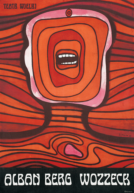
Title: Wozzeck by Alban Berg
Designer: Jan Lenica
Year: 1964
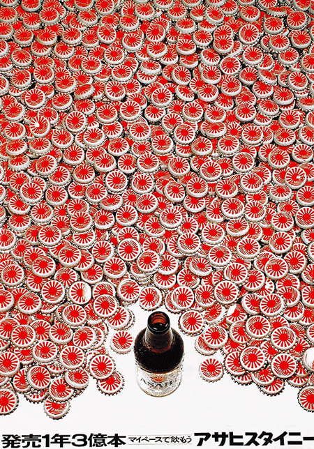
Title: 300 Million Bottles a Year. I Will Drink My Dose of Asahi Steinie
Designer: 永井一正 Kazumasa Nagai
Year: 1965
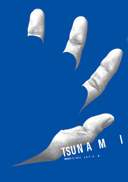
Title: Tsunami
Designer: Tetsuro Minorikawa
Year: 2011
"There are also series of posters that can examine side by side. There are similar themes or patterns in some particular periods or countries, such as cigarettes, skulls, or similar colour palettes, etc., that pay more attention to the political situation and creative background at that time. There are different levels when we are talking about posters, and you may appreciate the beauty of the graphic and content. But if you are interested in diving deeper, you can also study the creator's situation or related local cultural aspects, explore the mystery of the story behind, and question the future evolution of the poster." Aga said.
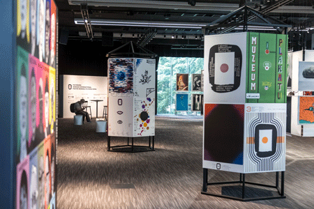
Posterized: Warsaw International Poster Biennale in Hong Kong
-
Date: 2021.3.26 - 2021.4.18
-
Venue: The QUBE, 2/F, PMQ