
Interview #23
East meets West: studioKALEIDO on designing for an increasingly intercultural world
Winnie Wu
Written by RMM
Photos by ©studioKALEIDO
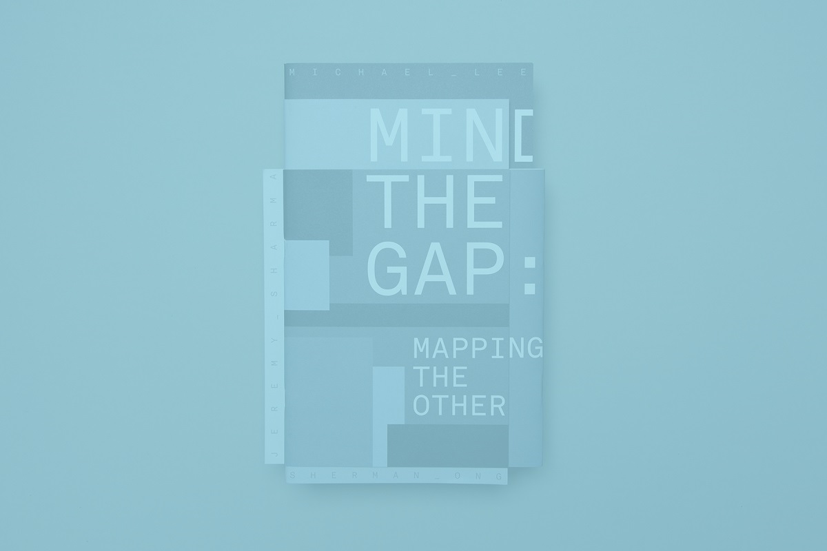
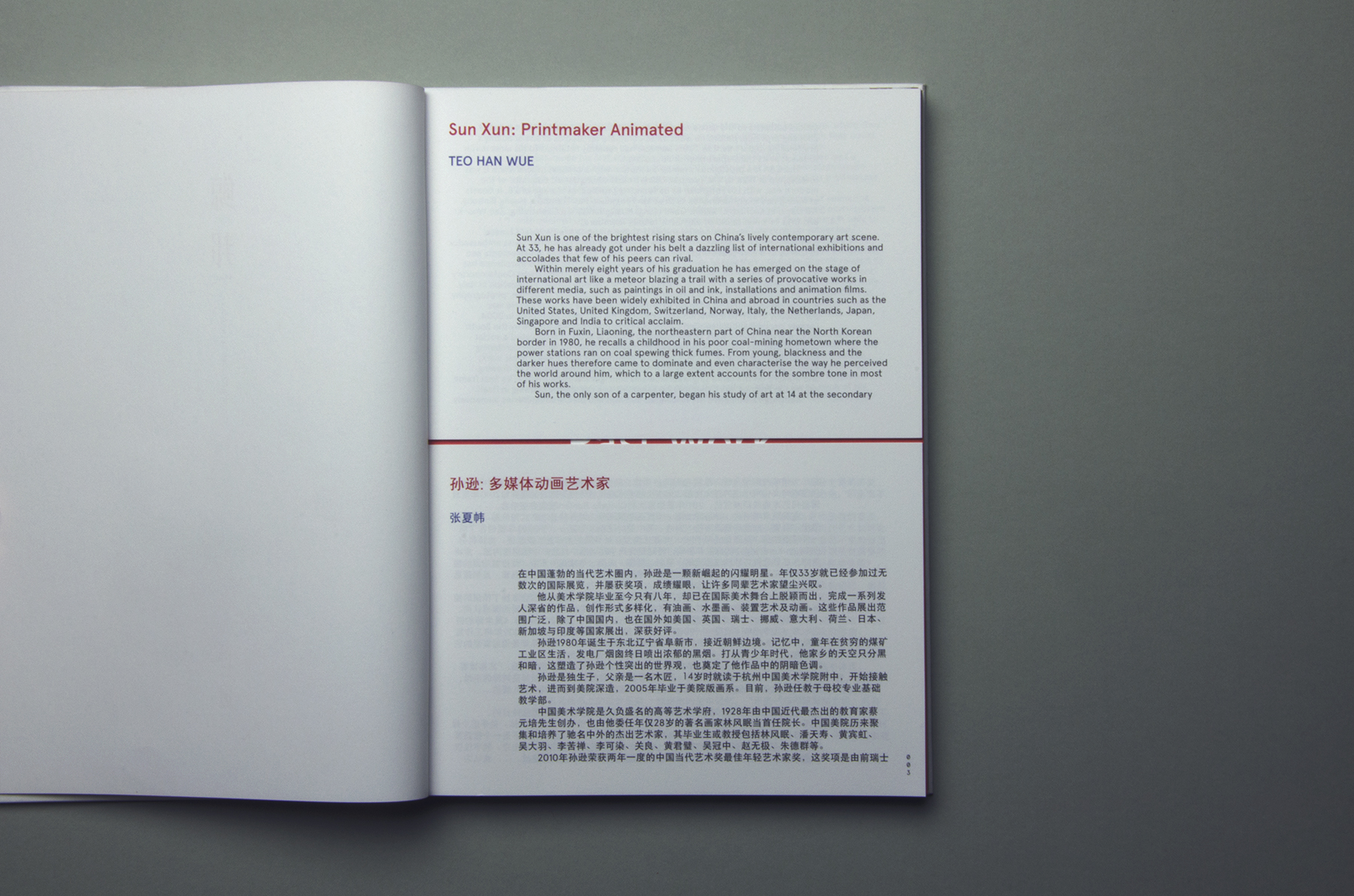
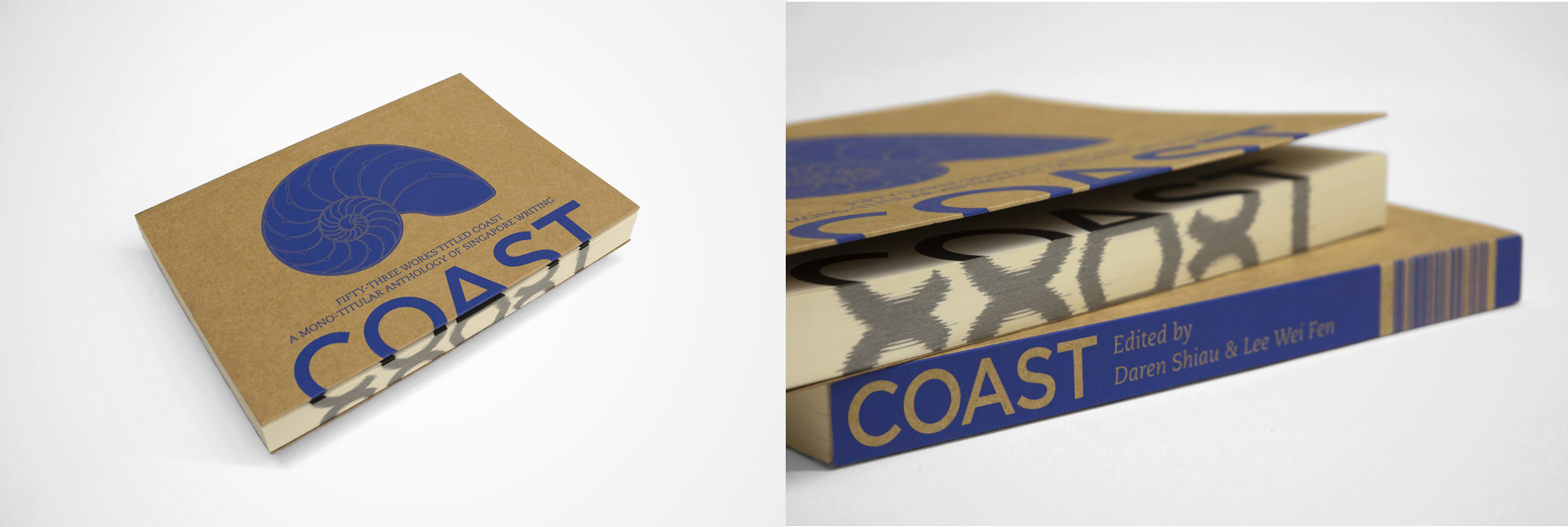
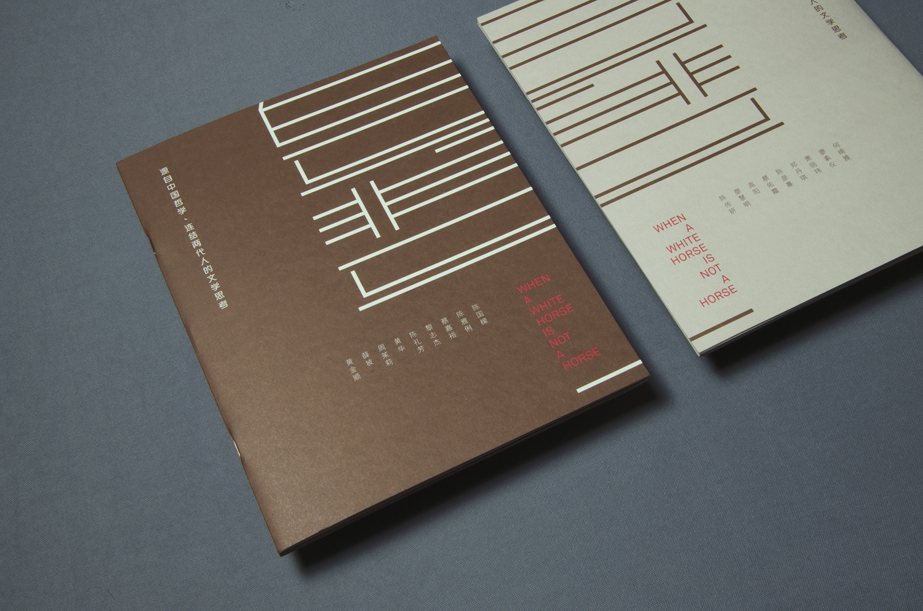
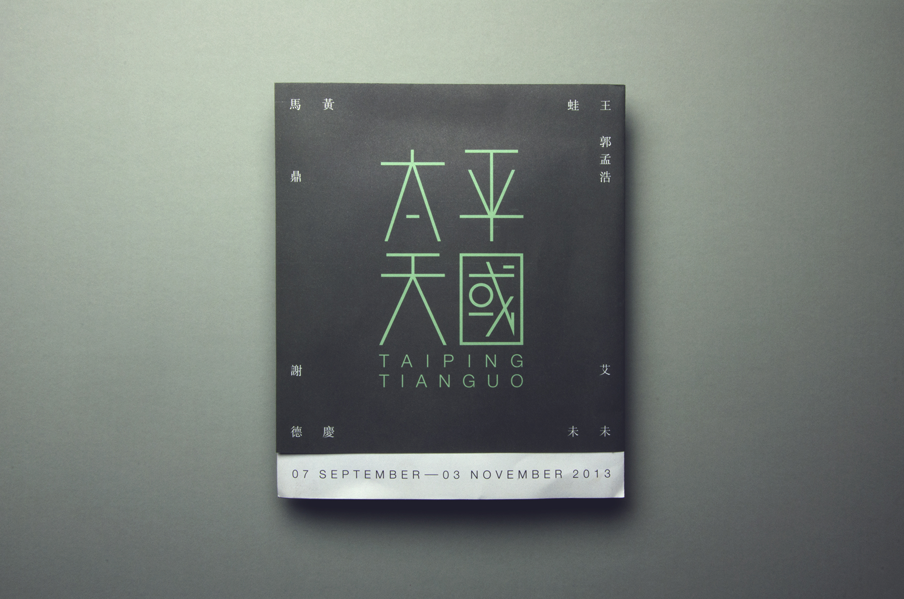
Based in Singapore, studioKALEIDO is a young graphic design studio and think-tank known for its bilingual and intercultural work around the region. studioKALEIDO’s portfolio is diverse as they come. It has produced its own literature journal, Ceriph, and events such as GRAPHEME Zine Mosh and the Art of Rebellion, the latter of which highlights long forgotten Chinese idioms. The studio is perhaps most well-known for its beautifully produced artist publications. It’s no surprise, since ‘kaleido’ means ‘beautiful form’ in Greek. But more than just pretty designs, the studio hopes to produce works that transcend boundaries in both concept and communication.
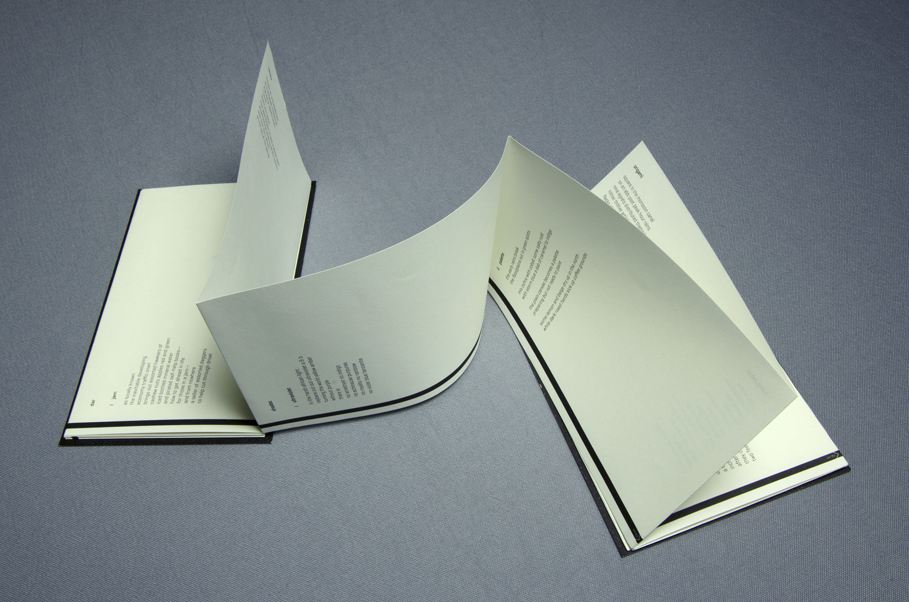
The studio is helmed by Winnie Wu, an award-winning bilingual designer who has been recognized internationally and counts the Excellence award Hong Kong Design Association Global Design Awards in 2016 amongst her accolades. She also regularly speaks at events around the region too. As an “impressionable tot”, Winnie fell into graphic design because she thought it was “a cool profession to get into”. Largely self-taught, Winnie’s sharp mind and design aesthetic are on the cutting edge of Asian design.
RMM speaks to Winnie about what motivates her work and how she negotiates East and West design in her work.
RMM: What shaped your design principles and philosophies?
Winnie (WW): My work is constantly evolving with me, so it is hard to say. I would say that it works the other way — graphic design has been a great profession for me to shape my life philosophies around.
RMM: Do other creative fields inform your work?
WW: I have an interest in creative writing so I always begin projects with a reaction to its title or text as a starting point. Sometimes there is not much of a reaction needed if the text and subject are plain vanilla and to-the-point. If I have to work with a badly-written text, I try my best to make it obscure or unreadable. Currently, I’ve been preoccupied with abstract art, ambiguity and alternative ways of communication, since much of graphic design, in a nutshell, boils down to bringing your client’s message across in a clear and concise manner.
RMM: Can you tell us more about how you try to reflect Asia in your work?
WW: I don’t feel like we [Singapore] have the context and history to create work that has a strong cultural backing, so much of how I try to reflect Asian-ness comes from aesthetic observations. Asian graphic design tends to feel less attached to modernism, and if we’re talking about kanji letters, a lot of it is somewhat mono-spaced and geometric. To me, the culture of Singapore is made up of a little bit of everything from everywhere. A lot of my work tends to revolve around the arts & cultural sector, so my portfolio, by the rule of subject matter, is a reflection of that too.
RMM: What kind of cultural differences do you encounter when designing for clients or projects in East Asia vs. more Westernised countries?
WW: I think more westernised markets tend to see modernist ideals as an aesthetic for professionalism, luxury, intelligence and maturity. Strictly modernist graphic design could come across as rather robotic, archaic and uninspired these days, but clearly there is still strength in understanding and operating within its rules. There’s a wide variety of well-designed classic fonts at our disposal when we’re designing with Roman letters, so there’s really a wealth of work done in type design in which we can draw upon. But for kanji, the selection of good fonts is a lot smaller since it takes a huge amount of time to design individual kanji letters. More often than not, glyphs for headlines or logos have to be drawn from scratch for the propriety of the design as a whole.

RMM: Your work encompasses branding, print, spatial, stationery, packaging and publications — do you have a singular vision that underscores all your work?
WW: I definitely want to add value, for the user and/or client. If I can include my own personality into client-based work as a second layer of thought, that’s a win-win situation for us both. It’s tough to have a singular vision as a graphic designer, but I would like to think I’m a rebel who pays attention to details. That lends itself to non-conventional formats or abstract forms that make the viewer question a little further. That could either be annoying or thoughtful, depending on who you ask.
Official website: http://studiokaleido.net.