


Design Feature #21
The Politics of Graphic Design
2016 US Presidential Elections
Written by RMM
Photo by Wikimedia, Donald Trump’sTwitter, Hillary Clinton’s Facebook Page, Pins Won’t Save the World, The Forty-Five Pin Project
America is obsessed with branding. It’s no surprise, really. This is the country that brought us Coca-Cola, the Super Bowl and Barack Obama. Yes that Barack Obama, the soon-to-be ex-President of the United States whose immaculate branding ushered in a new age of presidential branding.
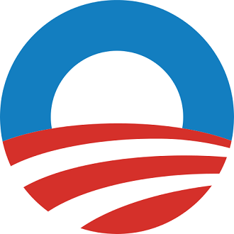
Image source:Wikimedia
With a top-notch team behind him, the Obama brand pulled every trick in the marketing book to create a potent POTUS brand that infused viral ringtones, excellent brand alliances (Oprah Winfrey, Beyonce and the Black Eyed Peas) and beautifully executed graphic design — or in the words of Naomi Klein, author of No Logo,
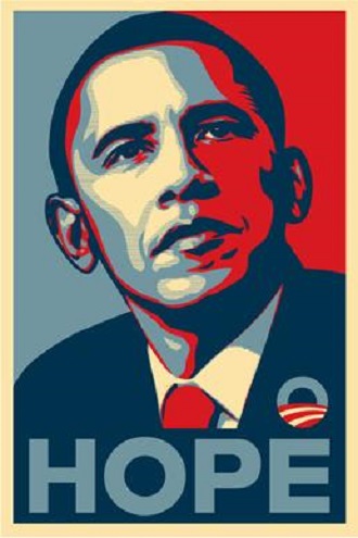
Image Source: Wikimedia
The combination of a light blue sky over the stars and stripes, set the tone for an unprecedented level of sophistication and savvy for political branding and graphic design. It went beyond announcing someone’s name, and symbolised a new beginning — that the stars were within reach. Coupled with Shepard Fairey’s now-iconic and much imitated (or parodied) red, white and blue collage of the then President-elect, the Obama campaign showed that graphic design could indeed humanize the presidential race and fuse Obama’s message of hope with the man himself.
Source: Wikimedia

Source: Wikimedia
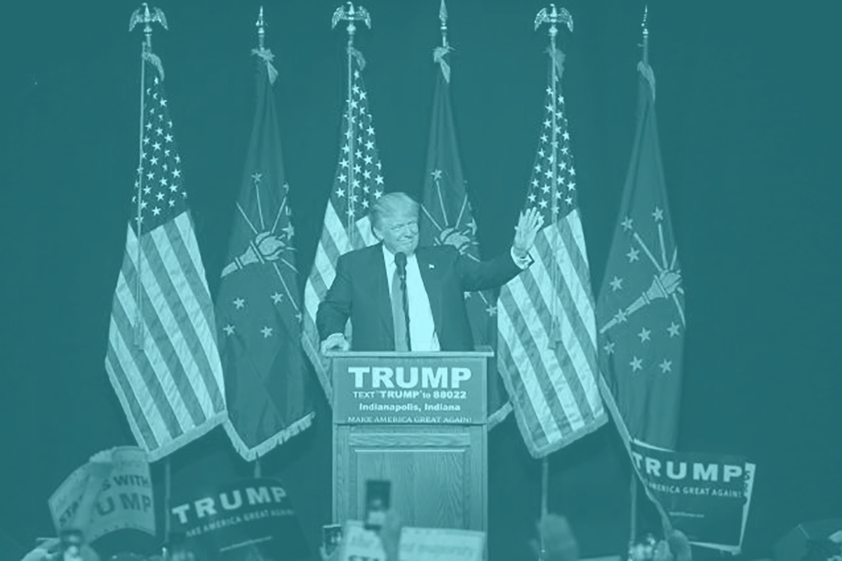
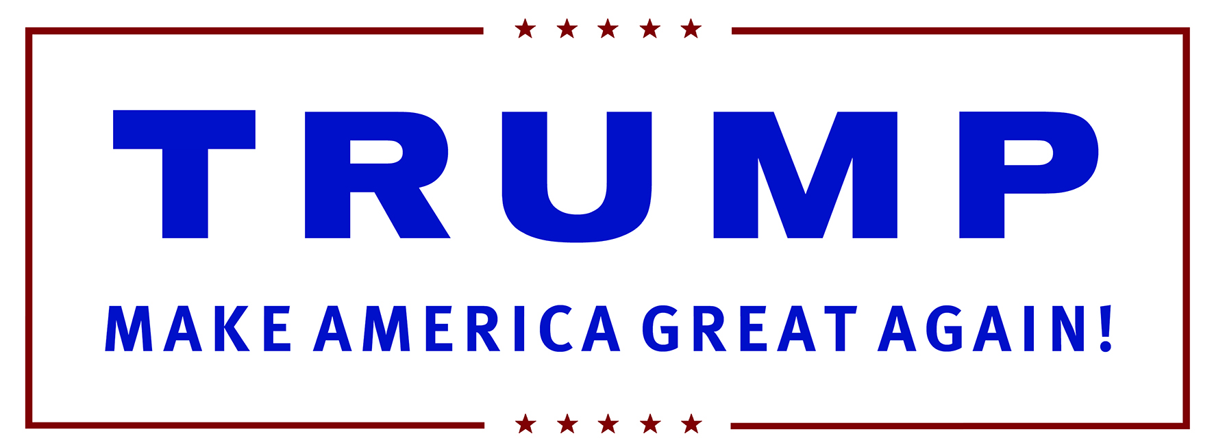
So now picture this: Donald Trump’s presidential campaign logo in the scribbles of Comic Sans and not the chosen font of Akzidenz-Grotesk BQ Bold Extended. No one would take him seriously at all — perhaps even his most loyal supporters would doubt his bid. For all his brashness, Trump realises the impact graphic design has on the general public.
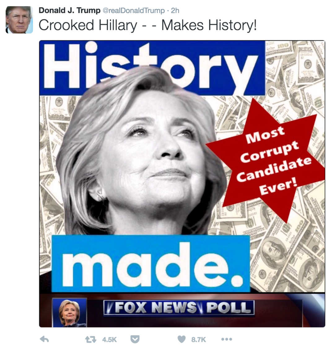
Image Source: Screengrab
In his hands, graphic design is used to incite anger, outrage and hopefully action (against his rival Hillary Clinton). Take this image he tweeted in July 2016 of Clinton against a background of money and a six-pointed star. It wasn’t merely the fact that he used the Star of David, an icon historically associated with anti-Semitic propaganda, that aggravated many; it was a combination of other colours, shapes and words that demonstrated insensitivity.
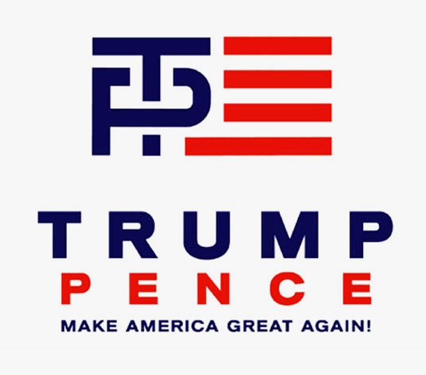
Image Source: Wikimedia
Trump’s latest Trump-Pence campaign also shows how visual miscues can cause unwanted attention. The interlocking letters T and P were obviously created to convey unity and strength — possibly even Trump’s own ‘supremacy’ over Pence — but found itself under ridicule over how the letters resembled a crude sexual act.
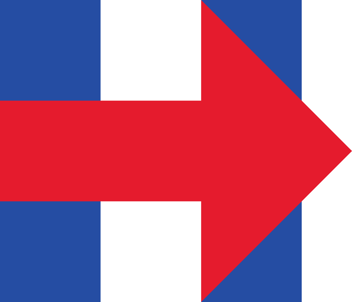
Image source: Wikimedia
Of course Clinton herself was not spared from any potential graphic design gaffes. When she first revealed her campaign logo in 2015, many took issue with the use of bright red (the colour associated with the Republican Party) and the fact that the arrow was pointing to the right (again, referencing right wing conservative thinking).
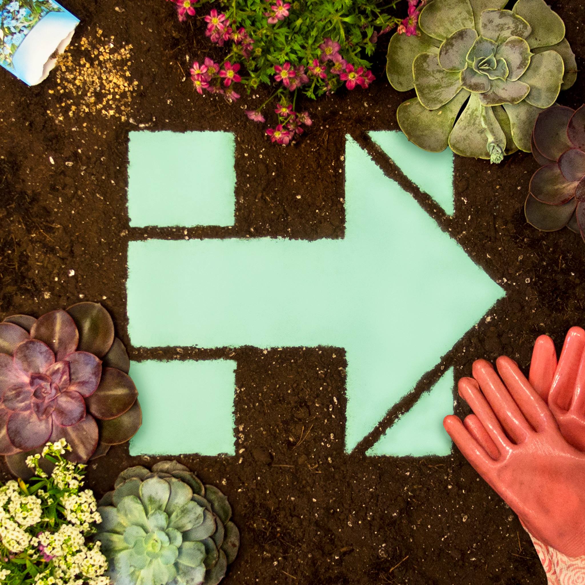
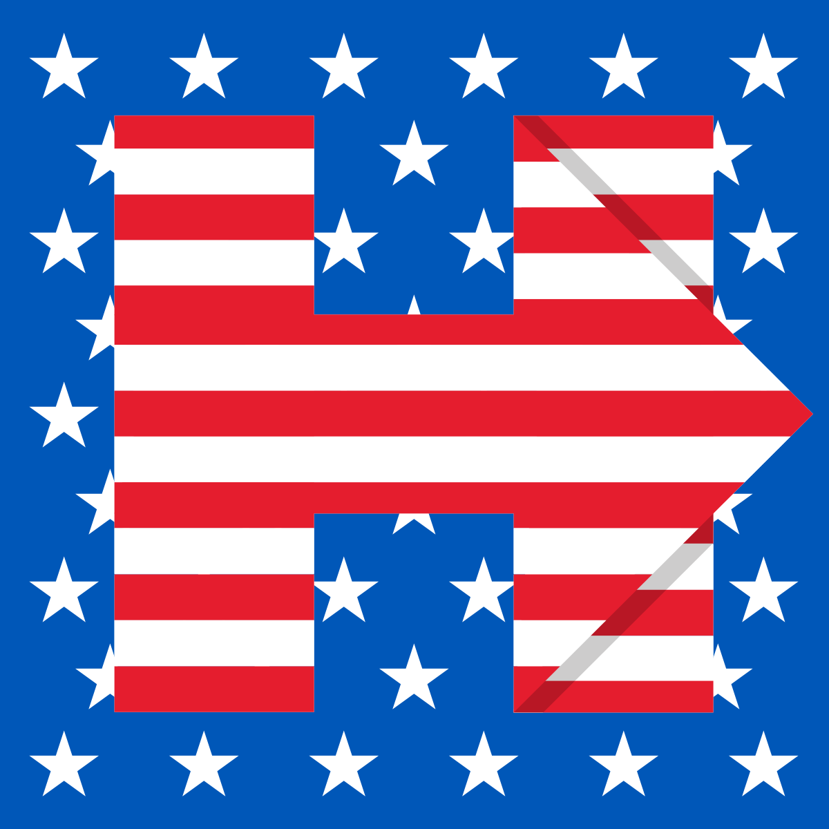
Image source: Hillary Clinton’s Facebook Page
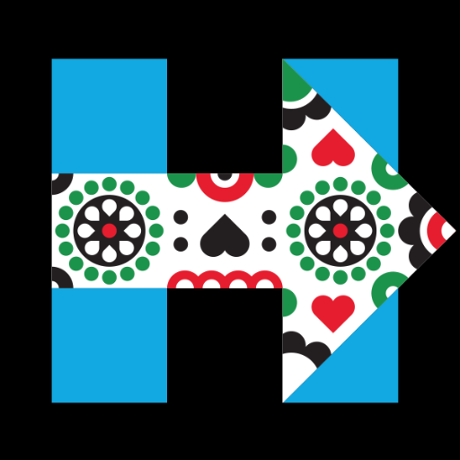
Image source: Hillary Clinton’s Facebook Page
Clinton’s logo has its fair share of detractors, but no one can deny that it is possibly the single example that comes close to the elegance of Obama’s 2008 campaign logo. It’s instantly recognisable while calling to mind the candidate’s name in a subtle way — H for Hillary — that’s personable and friendly: you’re with Hillary and not Clinton. What really takes her logo to the next level though, is that no matter the colours, it’s a wonderful framework to showcase the events and issues she cares about. It’s been draped in stars and stripes, the pride flag, a sentimental photo of mother and child, the Mexican sugar skull and even a turkey. It might not be the best campaign logo ever, but it’s adaptability works to her advantage.
Clinton, like Obama, has realised the importance of associating herself with savvy graphic designers, who can reach the public in refreshing ways. Aside from the upping her hip quotient, Clinton (or at least her marketing team) shows a heightened sense of visual intelligence.
Image source: The Forty-Five Pin Project
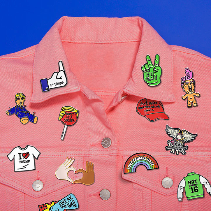
Image source: Pins Won’t Save the World
reatives have responded in kind to this new wave of creativity in political design. Most recently, New York-based Sagmeister & Walsh produced a series of pins, stickers, bumper stickers, patches, temporary tattoos, T-shirts and posters that are pro-Hillary and anti-Trump. Working with 15 illustrators and artists, Pins Won’t Save the World is a collection of 50 irreverent visuals that seek to inspire millennials to vote for Hillary.
With the results of the 2016 Presidential Elections now behind us, only time will tell if president-elect Trump’s visual brand and intelligence will change in the coming days. What sort of symbol, logo, typography — visual language, really — will the Trump administration adopt to reflect their tactics, goals and movements for the next four years? Uncertain, but exciting times lie ahead.