
Design Feature #53
Visual Metaphors to Represent Data
Domestic Data Streamers
Text: Kit Chan
Translated by: MJ
Photo: Kit Chan & Domestic Data Streamers
If you could forget something forever, what would you choose to erase?
Make your choice clear - the memory of a person, loss, resentment or perhaps that unnecessary argument you had and write it down on a piece of paper. Eventually the words will be gradually disappeared from sight and vanished into thin air. Will you have achieved eternal sunshine with a spotless mind? Will this section of your memory be filed away to be deleted, without pain?
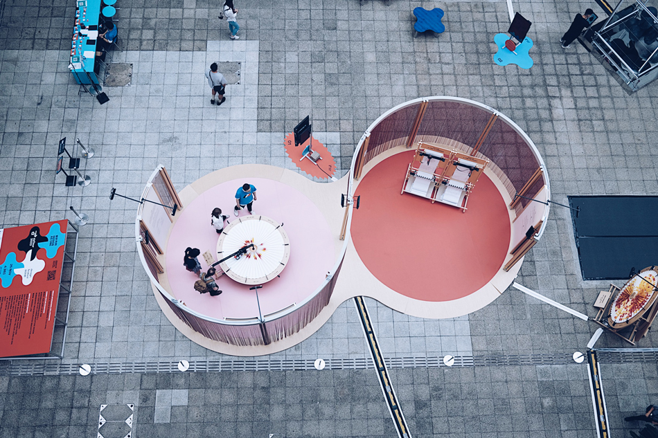
This is the latest installation “About Time” by the Domestic Data Streamers (“DDS”) from Barcelona. The crafty use of thermal paper, which changes colour when exposed to heat, brings a sense of melancholy to this year’s deTour by leaving a blank space. You can also choose “to remember”, by writing down your precious memory in a printer pen to make a black-and-white record. The immaculate fonts will then become the solid proof of its existence.
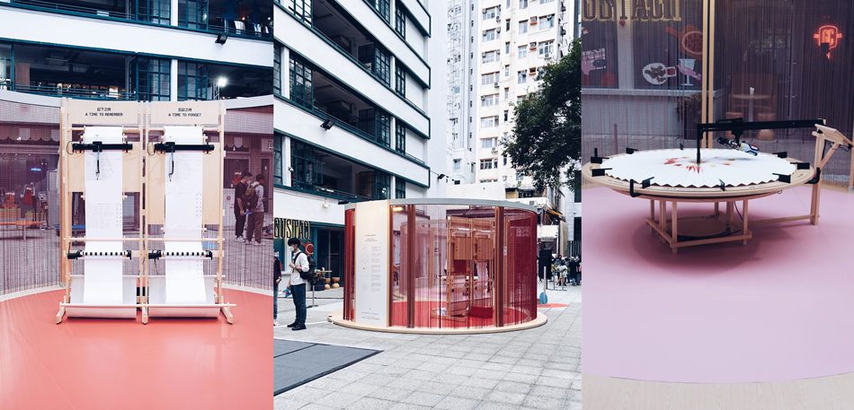
The latest installation “About Time”
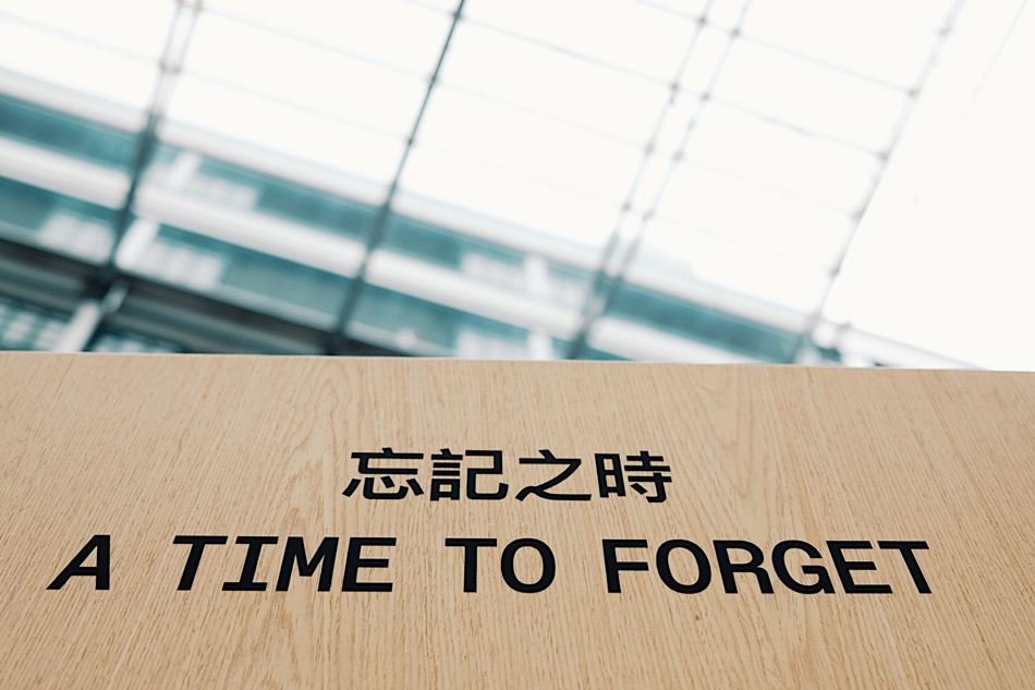
You can also choose “to remember”, by writing down your precious memory in a printer pen to make a black-and-white record. The immaculate fonts will then become the solid proof of its existence.
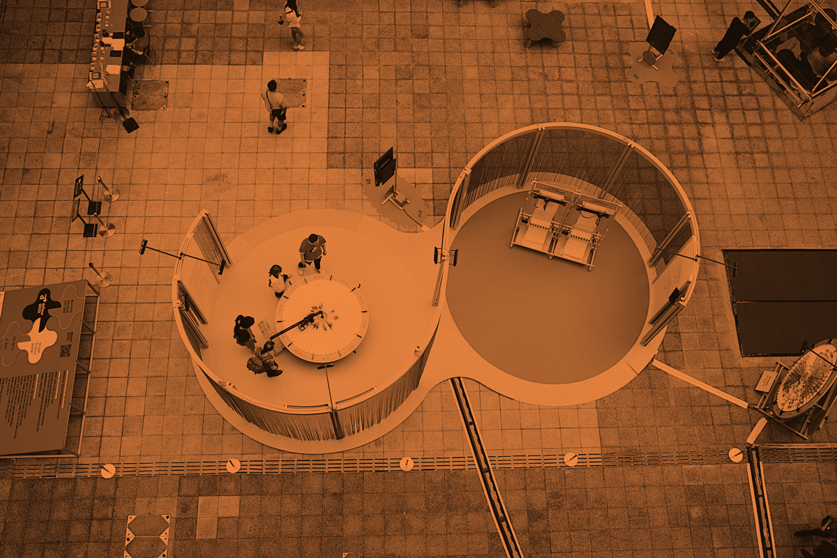
Another installation “Paper Clocks” from the same series is equally charming. Throughout the festival, the artist is trying to explore the different perceptions of time by asking participants one question a day. Participants can choose their answers by spraying a colour dot on a paper which represents their answer, each dot represents one participant.
Folding the paper into a circle, like a sundial, the radius represents time. After a day, there will be a collective visualisation showing the most popular answer and at what time the perceptions were formed.
Most importantly, this is not the type of graph one might see in a textbook but a piece of art which represents important data points created collectively by every single one of the participants.
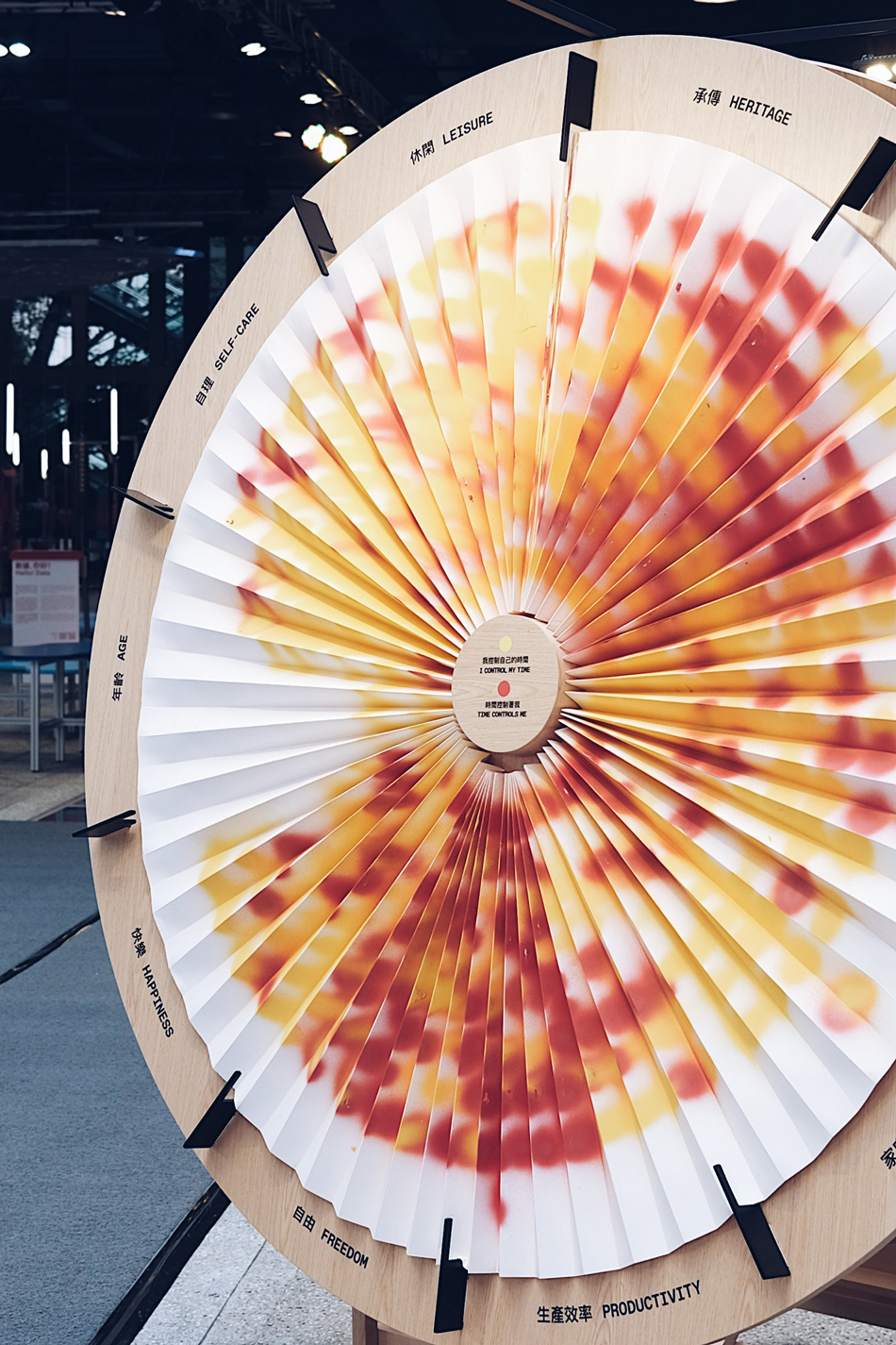
“Paper Clocks” — this is not the type of graph one might see in a textbook but a piece of art which represents important data points created collectively by every single one of the participants.

This explains the eccentricity of DDS — who resists telling the story merely through the numbers itself. One can’t describe this team of developers as the “designers” because the team of 25 (and growing) are a diverse pool of talent from multiple disciplines: Arts, Psychology, Anthropology, Science, Engineering, Data Analytics and more. Their work is about scientific matters but are created by crushing the concept of science. Simply put, they use visually pleasing, humanised and stimulating ways to demonstrate otherwise dull statistics, allowing room for imagination under the banner of data visualisation.

Domestic Data Streamers(DDS)
The inception of this data streaming experiment was serendipitous. Pau Garcia, one of the founders of DDS, used to be a graffiti artist. In 2013, he and his friends came up with the concept of a graffiti that could effectively quantify, visualise and express people’s thoughts in real-time.
As a result, they interviewed passers-by about their optimistic and pessimistic attitudes. Through visualising their answers in real-time, the graffiti showed how the mood of people from different backgrounds (and various income levels) was expressed at different times of the day. The group was approached by the director of the Contemporary Art Fair in Barcelona, who happened to walk by and was stunned by their work. The director invited them to exhibit their work at the fair. This became DDS’s first infographic and art installation called “THE MOOD TEST”.
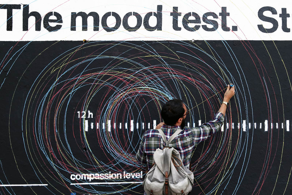
THE MOOD TEST
DDS’ previous projects have always applied the use of visual metaphors to represent data. For instance, “LIFELINE” in 2014 creatively visualised data representing the question everyone has probably considered at least once: How long do you want to live?
The team interviewed around 2,000 people, took surveys regarding demographics and life expectancy. They transformed the streams of data into an installation of 800 balloons in a room where black balloons represented death and white balloons represented life. The higher the black balloons, the more people from that age group would like to die at a certain age.
One will certainly be thinking about the same question when walking through the room full of balloons: finding the answers in their own age group, contemplating life and death through real-time interaction with the data.
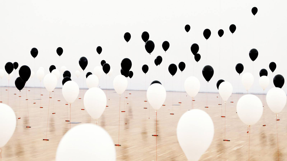
LIFELINE
DDS’s projects are not limited to the light-hearted domestic topics, they also shed light on social topics such as children’s mental health, violence and homelessness.
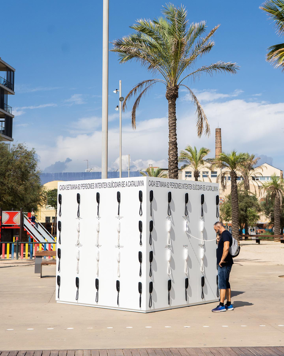
This year, DDS presented a visual installation regarding suicide issue among teenagers in Catalonia by erecting a large pop-up phone booth that holds 62 telephones waiting to be answered.
On the other end of the phone lines are psychologists, survivors’ families and medical professionals. Each telephone represents a phone call that could save a life just by simply taking the first step of communication: talking about it.
At times, data could be serious; but combining data with creativity, innovation and art will stimulate people’s interest in addressing the topic both creatively and effectively. We are living in an era where we are bombarded with information overload, where data can be so overwhelming that it loses meaning. This creative approach by DDS commands attention among a vast sea of data and inspires action through its unique representation.
DDS believes that, “The world couldn’t be understood without numbers, but it wouldn’t be understood with numbers alone”: When people start to genuinely care about data, then the data will become actionable.
“Fighting indifference towards data” - that’s the mission of DDS that pops up on their webpage, and also one they are executing effectively through their creative approach.
deTour 2022 International Collaboration:About Time
Humans have an inconsistent and fleeting relationship with time. Time flies when we’re having fun. It drags when we’re bored. Sometimes it’s on our side; at other times it’s racing against us. They say that time destroys all things but also heals all wounds. Our relationship with time is complex - it talks about our culture and character, and defines who we are and how we act. In this space we want to create an open debate about time through two installations that will grow over time thanks to your participation. Feel free to explore, play and join the discussion. Project designed and developed by DOMESTIC DATA STREAMERS.